Wednesday, June 19, 2019

“Charlotte’s Web” is the best marketing and public relations book ever written. Bar none.

That may seem like a pretty bold statement, particularly since “Charlotte’s Web” is a children’s book that, at least, on the surface, doesn’t seem to be about marketing or public relations at all.  But, even now you may be thinking, “Oh, I see where this is going, the spider advertises the pig, right?” and you are partially correct.  But, that alone doesn’t make “Charlotte’s Web” the BEST marketing book ever.  You can read McLuhan’s ramblings about mediums and messages and you might learn a few things.  You could read Ogilvie’s ten commandments and seven secrets, and you may be able to squeeze out a mediocre advertising campaign or two.  But, if you really want to learn what manipulating public opinion is about, then you need to read E. B. White’s masterpiece.  Here we will consider the genius of a book that passes itself of as a children’s book about life, death, and friendship when to the trained marketing eye, it is an entire business course designed to raise the art of marketing and public relations to an almost theological status.  All written in uncomplicated language that allows easy consumption of its sophisticated message.

At the beginning of the book, we are introduced to the would-be client, a pig.  Unimportant and diminutive in the marketplace, Wilbur is, like so many underdeveloped startup businesses, a runt.  Originally slated to be destroyed before he can get started, Wilbur is unexpectedly supported by Fern Arable.  Like most angel investors supporting small businesses, Fern can protect the young Wilbur during his early growth, but soon Wilbur outgrows his initial investor’s support and is moved to Zuckerman’s farm, and that’s where the real marketing begins.

“Some Pig” 

At the Zuckerman agency, we are introduced to Charlotte, a young, female copywriter who also happens to be a spider. She takes on the Wilbur account pro-bono and leads off with an experimental ad that immediately attracts attention.  The image is a simple pig in a pig pen, and the copy is, “Some Pig.”  The consumers of this ad are confused and mesmerized by its obviousness.  Of course, it’s a pig.  This is a farm, that’s a pig pen, and we are looking at a pig.  So, what?  After a while though, the ad makes us think.  What does this ad really mean?   Is it a positive ad suggesting that Wilbur is, in fact, something special:
     “Wow, that’s SOME PIG you got there!”?  
Or, is that not what it's saying at all? “Some Pig” can also be a negative statement:
     Office Worker One: “Who left this huge mess in the breakroom?”
     Office Worker Two: “Some Pig!”
I am reminded of the Volkswagen “Lemon” ad from the 1960s.  It’s a picture of a car with the headline “Lemon” under it.  The car is roundish and kind of looks like a lemon, but lemon is a word that most car makers wouldn’t want to be associated with their car.  We are intrigued by the single word and are forced to read more copy where we learn that the word lemon is a reference to the stringent Volkswagen inspections process.  Like the Volkswagen ad, Charlotte’s “Some Pig” ad confuses us, and we desire more information, but unlike the Volkswagen ad, there is no more copy to read, so we are forced to just THINK about it until the next ad.  Immediately, like flies, we are tangled in “Charlotte’s Web.”

“Terrific”

Any new ad campaign can bring in a few customers, but, after the newness wears off, the public begins to lose interest.  At this point, Wilbur, like any small business owner, begins to panic.  Time for another ad.  Charlotte returns with her second installment.  The image is the same, a farm, a pigpen, and a pig, but this time the headline reads, “Terrific.”  This clears up the questions from the first ad.  “Some Pig” is obviously a positive statement.  This isn’t just some pig.  This is SOME PIG!  In fact, this is SOME TERRIFIC PIG!  Charlotte begins to manipulate public opinion in her client’s favor.  Her copy has turned her web into a fishing line, and she is reeling us in. 

I would like to point out here, that, while all this copy is written in a spider’s web, (using Cavatica Sans font) not once does the spider take the center stage.  The public doesn’t think, “Hey, this spider must be able to write.”    In fact, the public doesn’t once even think about the spider.  They simply take what they are given.  The text MUST relate to the image.  The public connects the image to the copy and digests them together as one message.  Like a truly great advertiser, Charlotte accepts no fame for herself.  All attention goes to the client.

“Radiant” 

For her next ad in the Wilbur campaign, Charlotte pulls out all the stops.  She dares to use a word that has never been used to describe a pig, and in doing so, defies and challenges Wilbur’s would-be public to think beyond where their minds usually go when considering swine.  Charlotte’s “Radiant” ad pushes the boundaries while continuing the main message.  Radiant is the family car after a wash.  Radiant is the light in the window in the late evening.  Radiant is the sun itself, and now, Radiant is Wilbur.  Is this a bit over the top?  No.  This is way over the top.   Each ad raises Wilbur a bit higher.  On an upward arc that took us from “Some terrific pig,” we add the concept of radiance.  How extreme can this description get?  Where is there left to go after radiance?  This is a problem that Wilbur and Charlotte face after this ad.  Are they spreading it on too thick?  Are they “overselling” the product?  Charlotte’s response to these questions is pure genius.

Throughout the campaign's development, Wilbur remains in awe of Charlotte's work.  His start-up has lasted longer and gotten more popular than he could ever have imagined, and for this, he is clearly grateful.  He is, however, still the client, and he never stops worrying.   He constantly whines to Charlotte about the status of his business and the campaign. He spends his time mulling over feedback from the well-meaning (goose), those with negative bias (lambs), pessimistic rumor spreaders (old sheep) and non-caring bystanders who think they have no skin in the game at all (Templeton the rat).  This feedback continually convinces Wilbur that, at some point, the whole campaign will collapse despite Charlotte's best efforts.  He brings his worries to Charlotte who is, while sometimes annoyed by Wilbur's anxiety, always does her best to calm her client and stay focused on the bigger picture, their campaign's success.

“Humble.” 

At "Radiant", we, the public, are allowed to feel that this must be the end of the Wilbur campaign. In fact, Charlotte has just hauled us to the highest point of a roller coaster ride.  We sit, unwittingly teetering at the edge and waiting impatiently for the next aggrandizing buzz word when Charlotte sends us speeding back to the ground.  Just as we await our next helping of braggadocio, Charlotte serves us the exact opposite.  Charlotte’s “Humble” ad forces us to think again about where this campaign is going.  Similar to the “Some Pig” ad that started the campaign, this installment challenges us to wonder how something can be terrific and radiant, but also humble.

Here, it becomes necessary to point out that this is no ordinary campaign.  Anyone can sell a pig, right?  People do it all the time.  Ham, bacon, and sausage practically sell themselves and the only thing an advertiser needs to do is position the product in the marketplace.  But, THAT is the exact challenge of Charlotte’s campaign.  YOU CAN’T EAT THE PIG!  This isn’t a food campaign.  This is more like a PETA campaign.  The message being projected is that Wilbur is so special that you simply can't eat him.  It is ethically and morally impossible to eat “some terrific, radiant, humble” pig.  It was in the story all along, but as you follow the arc of the ad campaign, this concept side swipes you so hard that it knocks you off your feet.

Charlotte’s “Humble” ad is the best part and is also the logical end, of the Wilbur campaign.  The public now sees Wilbur, not as a simple product to be consumed, but an icon to be admired.  The people don’t just “buy” Wilbur, they develop “brand loyalty” to Wilbur.  Wilbur becomes a local celebrity; a staple; a household word.  Charlotte learns that the Wilbur campaign is a complete success just before she dies.

The Clio Award

In Charlotte’s lifetime, she goes from a simple copy girl to full blown ad executive, and she does it with only one campaign.  But, was the point of the campaign really just to save the pig?  Was that all?  No.  During the book, Charlotte manages to extend Wilbur’s product life cycle a few extra years, but then what?  Ad campaigns are finite.  They come, they hit or miss, and then they go.  They don’t grant immortality…do they? 

A spider-like Charlotte only lives for about a year, and the chance of her meeting, much less being admired by, the next generation is non-existent.  By saving Wilbur, however, Charlotte earns herself a documentarian.  Someone who will share the story of her success with the next generation, and possibly beyond.  You see, it was never actually about saving the pig.  The story was about saving Charlotte all along.  By putting her client first, Charlotte earns herself immortality that inspires the next generation, and beyond.  That is what a truly great ad campaign SHOULD do.   
Wednesday, October 5, 2016

The Computer Animator's DNA

Recently, I got a letter from a middle school student who was doing a report on careers and wanted to know about computer animators.  First, I was impressed that she actually found my business online. Eventually, the question made me evaluate myself, my chosen career and my associates who do the same.

Education:  

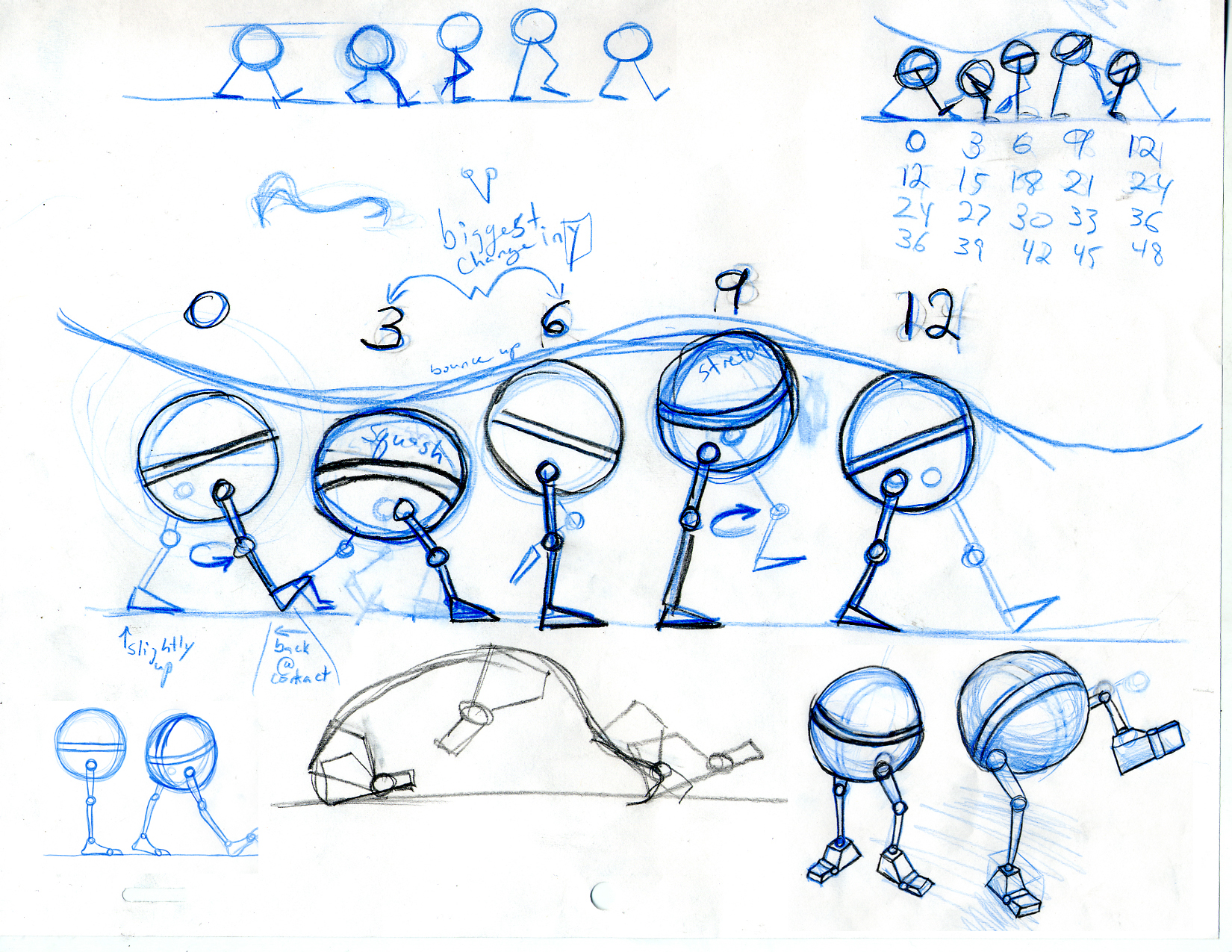
Computer Animation Math 01: Division: This is a sketch of an animated step taken from Washington University. The numbers represent film frames, so this character will take 12 frames to complete one step. That means 24 frames for a full cycle.
Most of the younger computer animators that I know went to school for computer animation.  They attended either an online or a four-year brick-and-mortar school, for animation, and got a degree in the subject.  Many of us older folks don't have degrees in animation.  In fact, many of us don't have degrees in computer technology or even art.  My degrees are in video production and marketing, and I have a strong background in stage production.

Oddly enough, I find the skill that I depend on most in computer animation is the two years I spent as a puppeteer.

Many teachers will tell you that you need to have good grades in math to do anything on computers.  Computer animation, like any other animation, does require a certain expertise in math.
I depend greatly on math for accurate sizing, speed and rhythm of my animation.  (See the Animation Story Problem.)  I use division a lot because, as a designer and animator, I always find myself trying to fit something into something else.  (Again, see the Animation Story Problem.)  I do need to point out, however, that many of the animators that I know, myself included, were originally terrible at mathematics of any kind.   That was just something we had to work through. For many of us, we didn't start producing computer animation because we loved math and wanted to make something great with it. Most of us love storytelling, and we use math to help us tell that story.

Animation Story Problem: If the character enters the screen from the left at frame one, and needs to meet up with another character at the right side of the screen in 3 seconds, and the film moves at 24 frames per second, and the character must take four steps to cross the screen, that means the character must cross the screen in (24 x 3=72) frames and each step can't take more than  (72 / 4=18) frames.  Using the walk cycle above.  What is labeled as frame 6 in the picture, needs to be frame 9 in our story problem, and frame 3 in the picture needs to be frame 4 or five in our story problem depending on what looks right.  Remember, it's math, but it's also art.

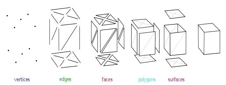
In the computer animation universe, everything is made of dots called vertices, lines called edges and triangles called faces.  When you get enough of them together, you get an object.

Congratulations, you just built something with math!

This is all clear as mud!

Don't Panic, the computer does most of the heavy lifting for you.  Still, the animator needs to master the program in which she creates, and that can take years.  I've used seven different computer animation programs in my lifetime, and I've mastered none of them.  The technology is always changing, and I'm always learning.  That's the business.  Learning doesn't stop with a degree and a job.
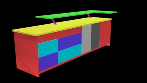
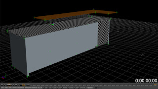
Computer Animation Math 02: Geometry


Image from Wikipedia


A kitchen island modeled at Novamation MEDIA

Personality:

The personality of an animator is hard to define.  Some of us work in large open animation offices where we interact with others on a regular basis, and a good extroverted personality is usually necessary in that situation.  Others, like myself, work alone in dimly lit offices where we spend several hours a day staring at a screen, and trying to get the branch of a computer-generated tree to sway in just the right motion.  It sounds bad, but that's just the kind of thing we love!  Many of us were introverts as kids who listened to emotional music in school, played WAY TOO MANY video games, and watched entirely too much anime.  (Yes, they had video games and anime way back in the 80's too.)  Oh, and I almost forgot about comics! Comics are just cartoons in storyboard form, so many of us read them, collect them and even draw them.  We spend a lot of time looking at each other's work to help our colleagues and ourselves get better at what we do.

Skills:

This one seems easy, but it's not as strait forward as it sounds.  As I stated earlier, while computer animation is an artistic field, we don't all know how to draw.  We are mostly sculptors who use light instead of stone, a mouse instead of a hammer and chisel, and little virtual triangles instead of clay.  But, that's not all we do.  We are also stage directors, lighting engineers and set designers.  The only skill that we all seem to share is that we are all creators, and we love to share what we create.

I hope this was in some way helpful to you.  I wish you luck and thanks for contacting us.

All the Best

D. A. Robinson


Sunday, September 18, 2016

Modern Skylight Bathroom - Final

Renovation of the Chicago loft bathroom goes on.  These images are the imagination of a 6'x10' bathroom space.  This the designer commissioned this visualization from Novamation MEDIA to create a photo-realistic experience for her client.  More fixtures have been added to the project.


The fixtures are added to the bathroom space for for evaluation, and the designer  approves.  Renovation of the Chicago loft bathroom moves on, yet...
  • no paint has been applied, 
  • no fixtures have been ordered, 
  • no electrical or plumbing has been installed, 
These images are of a "virtual bathroom" created at Novamation MEDIA.  Because the Interior Designer came to Novamation MEDIA first, the client can experience the designer's vision right now, before a single check is written.


More than just seeing what this finished project will look like, the client can feel what its like to be in the physical bathroom space by entering a fully functional panorama of the bathroom.  You can experience the space as well.  Inspect the vanity.  Stand in the shower, Sit in the tub.  Experience the space in a panoramic tour.


Vanity Shot


Shower Shot


Soaking Tub Shot

Friday, September 9, 2016

Modern Skylight Bathroom - Early view from the Soaking Tub

Modern Skylight Bathroom is the re-imagination of a space in a Chicago loft.  These images were created to demonstrate what could be done when an adjacent 2”x 6” closet is re purposed into an extension to the existing 6”x 8” bathroom, creating a new 6”x 10” space.  The designer wanted to see her vision before giving the quote, so she called Novamation MEDIA to create a photo-realistic model for her client.  This bathroom will also get light from three skylights located just above the tub, shower and vanity.

The modifications in this visualization include:

  • Atlas International styled low-flow toilet.
  • Wyndham Collection styled 60” center drain soaking tub.
  • Chrome freestanding tub filler.
  • Holden styled shower set.
  • Single-basin walnut and chrome vanity with chrome fixtures.
  • Chrome trimmed mirror and accessories shelf.
  • Textured drywall.
  • Walnut finished tongue and groove laminate flooring.

We moved in the new walls, floor and the major hardware, and we couldn't wait to take the first shot from the soaking tub.  Consequently, that is the reason why the tub isn't in the shot.  This bathroom is pretty small, but the tub is at the far end so we can use a 20mm lens and see most of the new fixtures.
In some tight areas, like the shower, we will switch to a 10mm lens for the best composition without getting extreme perspective angles.

Tuesday, August 16, 2016

Commissioned Artwork

Novamation MEDIA specializes in computer rendered artwork.  We provide services in:

  • Digital Animation
  • Architectural Design Rendering
  • Computer Generated Panoramas and Walk-throughs
  • Online Training and LMS
  • Database-Driven Graphic User Interfaces

Often, this means we convert your hand-drawn sketches and elevations, computer produced technical drawings, or even thoughts and ideas to add more realism or detail. Product demonstration images and architectural mock-ups are essential for design firms when pitching ideas to potential clients.

For this project, Detroit House Carpentry sent us a a SketchUp .dae file.  They needed several photo-realistic product shots of a custom kitchen island for one of their potential clients.


This is the original SketchUp .dae file for a kitchen island designed by Detroit House Carpentry.


This image is made from the Solid Model which was built in 3DS-Max. From this point, the model can be shaded, textured and made into a technical drawing or photo-realistic image.


This Line Art or Technical Drawing of the project is usually added to support dimension and other technical data about the project. It goes well with the black and white printed documentation included in the project folder.


This is the final Photo-Realistic product shot. As you can see, the model has been given several textures, been exposed to multi-directional lighting and has been placed in a semi-real-world environment.


Learn More about Novamation MEDIA at Houzz.com or LinkedIn.
Learn more about Detroit House Carpentry at Houzz.com.


Wednesday, August 10, 2016

Animation: Our First Love

We all perform different tasks.
Tasks that pay the bills we call our job.
But, where is our heart?
What is it that we love the most?

At Novamation MEDIA our heart is in Animation.  Don't get us wrong, we perform many tasks extremely well, but we really love building things and watching them move. Whether it's a motion graphic for an industrial video, or a fully articulated animated character, animation is where our heart is, and it is what we love the most.

This robot (EMU-Essential Mechanical Unit) is an animated gif  designed for Bully Comics story called "Anachronisms."

Tuesday, August 9, 2016

Jesi Lea's Illustration

Here's a 3D illustration we created for USA Today Bestselling Author, Jesi Lea Ryan.  Her collection is available on Amazon.  This product illustration was created for her personal web site, and it encourages her readers to download and enjoy.